Momo: Missouri Monster
GD210DigitalIllustration
Wednesday, June 11, 2014
Saturday, June 7, 2014
E. Kenney: Final Project: Critique 2 Progress
Better Late than Never?
This link is going to be really helpful in choosing colors and managing layers.
http://www.superink.ch/
So I realized what I was doing wrong... using process color technique and thinking rather than spot color technique and thinking.
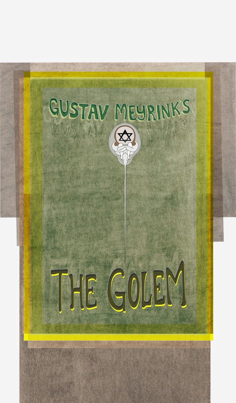
This is what I was working on that wasn't turning out well at all. Every time I increased the opacity, the basic shapes would turn into non-recognizable blobs. With more adjustment and planning, I'm pretty sure it will be salvaged.
This link is going to be really helpful in choosing colors and managing layers.
http://www.superink.ch/
Thursday, June 5, 2014
Final Critique_McCurdy
Made Golem Text slightly larger, more in height than width. Rearranged the BG charcoal layers but would do differently; would want the shadows to emit from the center out, Meyrink going up, Golem down.
Subscribe to:
Comments (Atom)


