Saturday, June 7, 2014

E. Kenney: Final Project: Critique 2 Progress

Better Late than Never?

So I realized what I was doing wrong... using process color technique and thinking rather than spot color technique and thinking. 


This is what I was working on that wasn't turning out well at all. Every time I increased the opacity, the basic shapes would turn into non-recognizable blobs. With more adjustment and planning, I'm pretty sure it will be salvaged. 


This link is going to be really helpful in choosing colors and managing layers.
http://www.superink.ch/


UPDATE 1 hour later: This is seriously looking 100% better already.


UPDATE 2: Sunday night. Working on filling in the background details.
Happy with the way the perspective and depth are coming along.  

Thursday, June 5, 2014

Final Critique_McCurdy

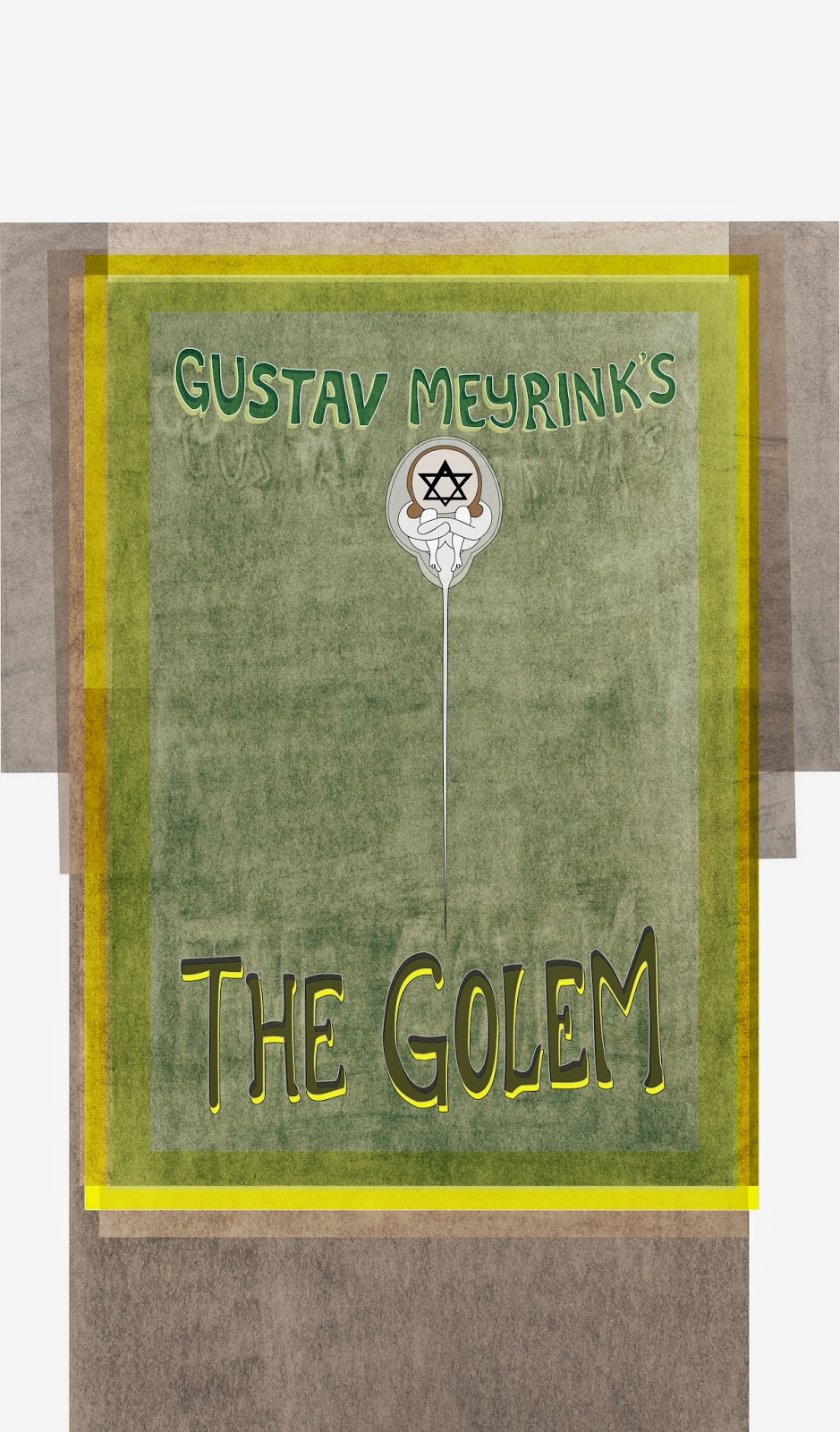
Made Golem Text slightly larger, more in height than width. Rearranged the BG charcoal layers but would do differently; would want the shadows to emit from the center out, Meyrink going up, Golem down.

Beuerlein Fear Final

I made the red a bit brighter so that it pops on paper

Game Poster Crit 2.5 | Nauseda


Monster-Final Critique Jaramillo


miti kotak - critique 3


Johnson || Final Crit


Final Critique Schipper


Patricia Brooks | Final Poster


Final Movie Poster


Monster Final/ S.Duran