Saturday, June 7, 2014

E. Kenney: Final Project: Critique 2 Progress

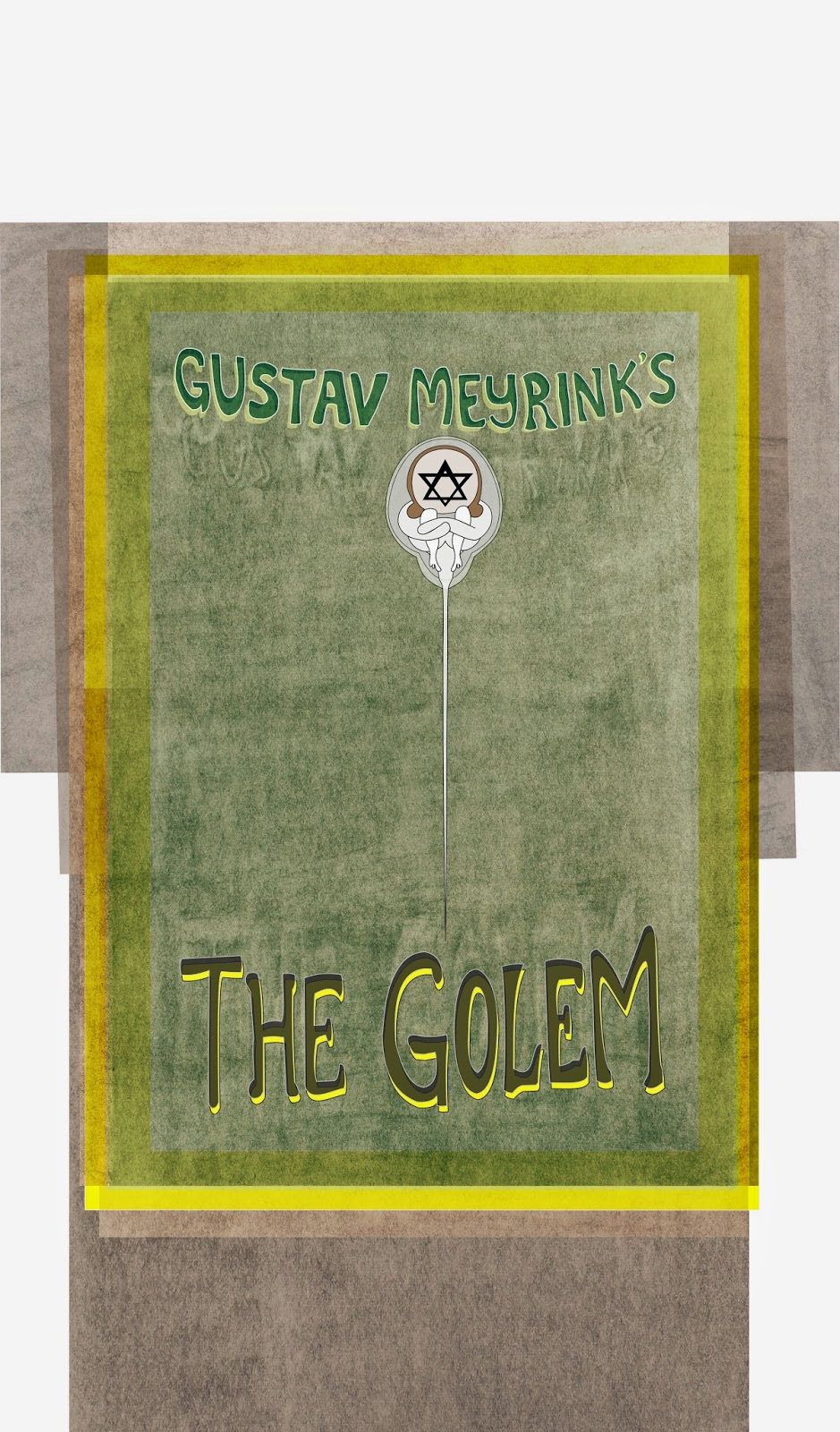
Better Late than Never?

So I realized what I was doing wrong... using process color technique and thinking rather than spot color technique and thinking. 


This is what I was working on that wasn't turning out well at all. Every time I increased the opacity, the basic shapes would turn into non-recognizable blobs. With more adjustment and planning, I'm pretty sure it will be salvaged. 


This link is going to be really helpful in choosing colors and managing layers.
http://www.superink.ch/


UPDATE 1 hour later: This is seriously looking 100% better already.


UPDATE 2: Sunday night. Working on filling in the background details.
Happy with the way the perspective and depth are coming along.  

Thursday, June 5, 2014

Final Critique_McCurdy

Made Golem Text slightly larger, more in height than width. Rearranged the BG charcoal layers but would do differently; would want the shadows to emit from the center out, Meyrink going up, Golem down.

Beuerlein Fear Final

I made the red a bit brighter so that it pops on paper

Game Poster Crit 2.5 | Nauseda


Monster-Final Critique Jaramillo


miti kotak - critique 3


Johnson || Final Crit


Final Critique Schipper


Patricia Brooks | Final Poster


Final Movie Poster


Monster Final/ S.Duran


Wednesday, June 4, 2014

Carolyn Duff - Final


Final Project || Final Critique - Lauren DePree


final -katherine


Movie Poster Final-Jacqueline Lin


Fred - Film Poster Final


Final Elizabeth


Mulan Final Crit


I changed the background,  smaller the size of types and edit some detail.

 This will be the final version of my poster.
   
Which one do you guys prefer? The one with stamp or the one without ?


Movie Poster Final Critique-Katelyn Pesola


Fear Final - Citlali Renteria


Carey Final Film Poster


Sloane Smith Final Crit


Here are the finals. For the top one I added to the line width and took the transparency of the brush strokes down to 13%. For the second one, I changed some of the buildings and rearranged them. I also moved the whole this over to the left so the type would have some breathing room next to the right edge. Let me know which one you prefer.

Tuesday, June 3, 2014

Belfsky Crit 2


Patrevito - Film poster Final critique


Crit- Katherine

I'm changing the text to "Have You Seen Me?"

Beuerlein Critique 2

Design without the barcode...

I just have to fix the red for printing!


Carey Poster

So pretty late in the game yesterday I decided to change the way I was doing my poster and so i only had time to work on this bit of it. I have a lot of cleaning up to do with the triangles and I think I will have them be color tone. Also going to add larger triangles to the back.

Lauren Johnson Crit 2


Crit 2 | Nauseda

Added the figure, a bonfire. They are a key element in the game, providing the only areas of safety and light. the blade is twisted and has four branching hand guards. I think I'm going to do away with the black bar and place text elsewhere. 

Movie Poster - Crit 2


Critique 2


Added shading and details to the face, arms, and clothing, scratched up the surface of the floor and added detail to the "shadows" in the wall which I will touch up later, 

I am still working on it have a lot to add. The background is going to change and I still have to add more details on the women. After that is done I will decide the placement of the text. 

Monday, June 2, 2014

Project 3 || Final Critique


So I am really struggling what to include on the spread. I want it to feel very much like a magazine spread. I played with more text and more options but don't want it to be to text heavy. Any suggestions? Also, the sticky note needs to be integrated more - I'm just not quite sure where I want it yet. Any thoughts?

Fred - Film Poster Critique 2


Not quite sure how I feel about the text.

Fear | Critique 2 | Hadiya Robinson


I like what I've done but I feel like it's too much whitespace, should I add shading to the walls? I feel like there should be some color but I like it black and white, any suggestions? Also, is the text legible?

Fear crit 2 - Citlali Renteria

After I drew the white illustration it reminded me of Roy Lichtenstein's action word pieces, like this one...

so I went with his style.
Does it work?

Patricia Brooks - Monster Project


I plan to add the following:

  • Fur/hair
  • More angry features in face and skin folds around eyes
  • Mouth
  • Small water drops on web
**If the print is too dark I will have to adjust the color for more contrast. I plan on using glossy paper. What do you think?

Movie Poster Critique 2-Jacqueline Lin


Elizabeth- monster project


Game Poster Crit 1 | Nauseda

Still a lot to do obviously. The sun is a big theme in this game so I was going to play off that, with a sort of constructivist theme that I like so much. Will probably have a figure in the center of some sort.

Poster Crit 2